Mobile Friendly Test

Why Choose Entiretools.com
We built Entiretools.com to provide you (All In One) PDF & Website Management Tools to save time and improve your productivity.
Unlimited Use & Limited Ads
Entiretools is entirely free. You can use it any time without restriction.
Fast
All the Tools processing time is faster we use cloud server.
User Friendly
All the tools are designed for all age group, Advance knowledge is not required to use.
Data Protection
All your files and data entered are secured.
Quick and Easy
120+ Tools are available in 7+ major languages.
Support All Browsers
Entiretools.com can be accessed on any browser with an active internet connection..
Batch Converter
Save time with batch converter, instead of converting one file, you can convert multple-file at once.
Multi Language
120+ Tools are available in 7 major languages.
No Registration
Use our 200+ tools without registration and providing personal details.
Auto Deletion Files From Server
Your uploaded files and contents are saved for only 24 hours. We use the auto-deletion mode to clear up files regularly for ensuring data safety.
No Installation
No matter! Mac, Linux, or Windows machine, Our tool can run on ANY device. You don't need to install anything to use our tool.
Quality is key
We use the Solid Framework, A powerful publishing framework.It has the best Technology for converting Documents which keeps the standards and quality high!
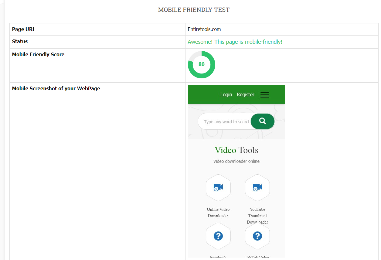
Mobile Friendly Test
What is the mobile-friendly test?
Mobile Friendly Test is a web application designed to evaluate websites for mobile-friendly compatibility.
Google created it in 2009 to help website owners determine which version of a site is mobile-friendly. The test was later updated in 2014 to include responsive designs.
Why is a mobile-friendly website essential?
Mobile-friendly websites are more convenient for users. A mobile-friendly website is easy to navigate and allows the user to access the website easily. This is the most preferred website design these days. Many factors contribute to this demand for mobile-friendly website design. It is a fact that the number of mobile devices is increasing exponentially. The users prefer to use their smartphones and tablets instead of desktop computers. Hence, business owners need to have a responsive website design.
Your website should always be mobile-friendly and optimized. A lot of people visit your site using their mobile devices. If your site is not mobile-friendly, it will be difficult for users to access your website. So, make sure that your website is mobile-friendly and optimized.
How to use this tool?
It's simple to use this tool.
- Visit this link for a friendly test
- Enter your website link
- Wait for a few seconds
Ten tips to make your website mobile-friendly
Mobile web is becoming more and more critical. However, not everybody has time to test their websites on a mobile device. And even if they have the time, they don't always have the technical skills to ensure their site works correctly. That's why we recommend using a responsive web design. You can do many things to improve your mobile site's performance.
Number 1: Test on multiple devices
Testing on mobile devices is different from testing on a desktop computer. So, it makes sense that a test on a desktop might not produce the same results on a mobile device. Instead, you should do the test on the different types of mobile devices that you use.
Number 2: Make sure the URL is mobile-friendly
A lot of people still use "normal" URLs on their sites. While they work fine on a desktop computer, they're not mobile-friendly. In the new URL scheme, you should use a hash to separate your domain and subdomain names.
Number 3: Use a web font for smaller screens
Instead of relying on the browser default, try using a web font. Web fonts look great on larger devices. They scale well to different sizes and are super lightweight. And they look great on mobile devices. The only downside is that the user experience is a little bit different. When someone is on a mobile device, they won't see all the characters. They will only see the ones in the web font.
Number 4: Optimize the images
Use the right size for your image. Most images are not optimized for mobile devices. Instead of uploading a 400×400 image, you should upload a 150×150.
Number 5: Make sure there's an alt attribute for the images
This is very important. On desktop devices, people can click on the image to view it. However, mobile devices usually tap on the image to see what it is. So, the image should have an alt attribute. If a person can't read the text on your site, they will have difficulty tapping on the image to get to the link. The alt attribute is optional. Search engines will read the description and display it in search results if it's there. But even without it, the image will show up.
Number 6: Include a favicon
This one sounds pretty dull, but it's essential. Having a favicon next to the website's name in the address bar would be best. It's similar to a favicon for social media websites. The icon is tiny and usually shows up in the address bar. People recognize it and think that it belongs to the website. But when you visit a website, the favicon doesn't necessarily indicate a connection to the site.
Number 7: Use a mobile-friendly analytics tool
Analytics tools can help you measure the performance of your website. But they don't always perform well on mobile devices. That's why you need a tool that measures your site's performance on mobile. Google Analytics, for example, is excellent for desktop users. But on a mobile device, it's missing some vital information.
Number 8: Reduce the number of redirects
Redirects can break the user experience. It takes longer to load and requires the user to wait while the page loads again. In general, you should keep the number of redirects to a minimum.
Number 9: Keep the content light
Mobile-optimized websites are very light. It would be best if you didn't have a lot of graphics and videos. Try to keep the content brief and clear.
Number 10: Don't forget to use schema
Schema markup tells search engine crawlers that a webpage is mobile-friendly. If you don't use schema markup, search engines won't be able to index the page correctly. It's another easy way to optimize your site for mobile devices.
We Build Tools with Love for Student's , Businesse's, Writer's,SEO Expert's & Common People.
Keep in Touch
ADDRESS
Street: P.O.Box 55789, Dubai, UAECONTACT US
TooliyoWeb@Gmail.comCopyright © 2024 Entiretools.com. All rights reserved.